Over the past week, two famed sports teams have unveiled new logos, and now the community is asking one question. To quote Jeremy Clarkson from The Grand Tour, “How hard can it be?”
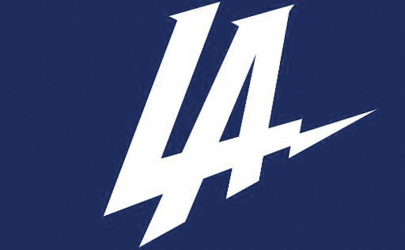
Let’s start with the one most familiar to the American audience, the San Diego/Los Angeles Chargers. With the relocation of the team to LA, the organization dropped a new logo and it was terrible.
It was a simple italicized LA that overlap and with a lightning bolt tailing off the L. The color scheme was blue and white, similar to that of the Los Angeles Dodgers with the bolt looking like something from the NHL’s Tampa Bay Lightning. In the age of social media, the reaction was swift and negative.
Twitter blew up with variations of the logo, with “LOL” and “LAME” spelled out in the font, Harry Potter’s famous scar changed to the logo, and a simple L.
That was just the fan reaction. Other sporting organizations hopped on the bandwagon; the Dallas Stars released their “new logo,” which looked familiar. It was the star of the Dallas Cowboys logo with the color changed to the Stars green. The Sacramento Kings trolled the Lakers with a proposal for them.
It even got to the point that the Lightning had to clarify that they “are just friends” with the Dodgers.
The Chargers have since made two changes to the logo, the first changing the color scheme to the Charger’s light blue and yellow. This was welcomed by being photoshopped onto Pikachu’s tail. The next change got rid of the LA altogether.
And still, it was booed at a Clippers game last week.
Then just this week, Italian soccer giant Juventus dropped their new logo. The old classic was replaced with a J in a fancy font. Not surprisingly, Twitter had another field day.
So, the question that must be asked is why do teams change their logos? For the Chargers, it was all about rebranding during the move to a new city. But this was a special logo.
In an interview with NBC Sports, the Chargers president of business operations A.G. Spanos said the logo was supposed to “launch our brand into the market and supplement — not replace — our official team marks.”
It is an odd move to have your first released logo be promotional. Most teams that pull that stunt already have a main logo. Hard to blame the public on misunderstanding the logo’s use, when it is not known what the logo is going to be.
As for Juventus, it is hard to see why the change occurred. The club has been around since 1905, and the crest has not changed much since. And even during an odd phase in the ’80s, the central bull has been part of the logo. It is all gone now.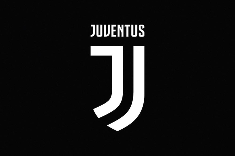
This shows that the world as a whole is changing, becoming less rooted in tradition. It is a bit of a shame really. Perhaps one of the good stories about the Rams going back to Los Angeles was based on the historical context.
Think, what if the Bison revived some of the old logos, that would all be fine. But if NDSU created a new logo, and it did not have a Bison, it is a safe guess that there would be some backlash, and students would go on to create their own.